Hello Monday.
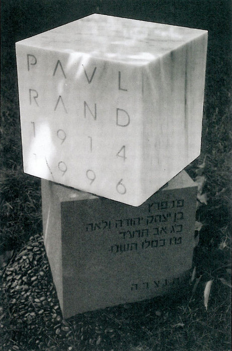
Ever heard of Paul Rand? Oh and if you haven’t, it would be really, really worthwhile to find out about him. He is responsible for many design icons including the IBM logo, the old UPS logo, the Westinghouse logo. Oh, and his real name is Peretz Rosenbaum (He recently died)
3 simple ways to better design
You know it has happened…
You spend loads of time on a design…designing and redesigning.
But, someone feels missing…actually, something IS missing.
Let’s us go through some really simple steps that will help any design.
1. Walk away from your design.
Yes, I mean just that. Take a walk around the block, or even go to sleep (if it is night, of course)
When you are staring at a design for too long, it becomes a part of you, a part that you do not want to criticize as something lacking.
That removal from the scene, allows you to look at the world, ineract with other people, things and life in general.
It will help you get a fresh perspective…that will help you solve the problem with a quick design change….or give you an entirely new perspective, resulting in an entirely new super fresh design.
2. Strip down the design to its bones.
Take a deeeep breath.
OK. Now.
Look deeply at your design. Write down on a paper what the goal of the design is.
Does every item on the page work hard to support the goal?
Does your visual match the goal. If you have a headline as well, does it work with the visual as a complement or is it saying the same as the visual and vice versa.
Take out any repetitions (that can be images, or wording.)
Respect your reader’s intelligence, you do not need to repeat yourself.
Is everything in the design legible…Make sure each item has a chair to sit on…That is accomplished with good alignment (line up words, images etc appropriately).
Group items that relate to each other together.
Take off items that you think are cute or cool, but really have nothing to do with the company or the item you are trying to promote.
Bottom line, your design should be promoting the item/service, not that the item/service should be promoting your design
3. Is it the right personality?
If you are designing something serious, does the font feel serious?
If you are designing someone fun, why get all serious.
Oh wait I forgot something crucial…cut down the amounts of fonts!!
Yes, I know you have about 546 fonts installed on your computer..so it would be stupid to just use 2 right? wrong.
Be stupid..I give you permission.
Constrain yourself to 2, or even 1 that have different styles. Once you are super confident with choosing 2 fonts that jive together, then you can graduate to 3, maybe.
OK, let’s talk color…if not sure take out your color wheel and choose proven color combos. Don’t try to reinvent the wheel (pun intended)
If you are still not sure…stay tuned for our follow up blog post: Tried and true simple designs that will always work (Illustrated)
Now it’s your turn, what have you found has helped you create better designs? Leave us a comment below!