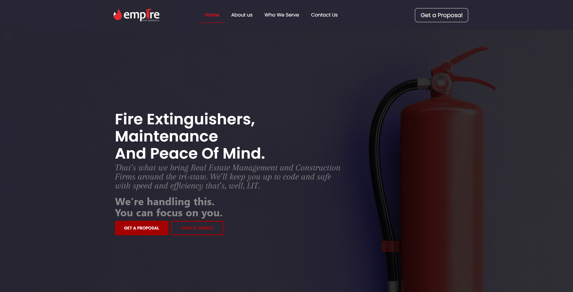
Web Design · Projects
read first
Before you scroll down-I want to give you a brief intro.
Websites don’t just happen, poof from the air. In order to have a properly structured, beautiful website that will achieve their client goals–each student followed this web design process (with stops for approval from mentor, along the way). They also had private sessions with our design mentors:
- Going over the client brief to get an understanding of their website needs, and what the goal was for the website.
- Once that was done, they got the website copy from the copywriter or ChatGPT.
- Using the copy as a guide, they created a moodboard, complete with color, typography, image type, mood and more
- They created a wireframe (a basic layout of the site)
- Then came the real stuff: Creating a completely custom design for the client in Adobe XD or Figma
- Then onto WordPress development. The custom designs are integrated into WordPress.
- Each student painstakingly goes over their website to make sure it is responsive on all devices (adding custom coding as needed)
- Security, backup, SEO and more in place
- Custom dashboard and training videos
Mazel Tov! A new website is born!
Celebration Creations
This website was designed by Goldy Edelstein for Celebration Creations, an event planning company.
The royal colors, with matching imagery really gives the website an upscale look. The icons chosen and well placed lines really makes it so user-friendly.
Sunshine Daycare
This website was designed by Adina Lopian for Sunshine Daycare, an innovative daycare company.
Check out the 3d custom images, the cool hot pink color, the splashes of paint and the kid-looking font that still looked professional enough for the parents.
Flour & Hearth
This website was designed by Roizy Rosenbaum for Flour & Hearth, an artisan baking company.
From the warm browns, to the pop of modern blue, we feel that cozy yet current atmosphere. Check out the header layouts on each page which is a complex layering of texture and images.
Literacy Solutions
Chefs Haven
This website was designed by Temmy Barth for Chefs Haven, a catering service.
From the gorgeous imagery, do the crips patterns and typography, this websites really showcased the professionalism of the company.
Fraidy Jerusalem
This website was designed by Leah Weber for Fraidy Jerusalem, an expert copywriter.
From the fresh aqua coloring balanced by serious black, the unique tape effect (positioned perfectly, no small feat) and the cool line illustrations, this is a professionally unique site.
Esther Scheier
This website was designed by Michal Schwartz for Esther Scheier, an expert copywriter.
Check out the organization of the information. There are lots of peek-a-boo features to keep things clear and beautiful while avoiding word overload.
Presicion Framing
This website was designed by Shira Broder for Presicion Framing, a construction company.
Check the subtle building visuals and linework. Also, the cohesive layout that has all the elements flowing from page to page. There was some complex layout maneuvering to get things coded correctly plus exactly right on mobile.
Rivkipix Photography
This website was designed by Brynie Roberts for RivkiPix Photography, a photographer based in Yerushalayim.
Rivki wanted a very clean aesthetic, with the focus on her gorgeous photos. Lots of white was used, paired with with great typography and subtle design touches. Even the contact form follows this clean look, resulting in a complete gallery experience
CST Copy
This website was designed by Reisy Kraus for CST Copy, a copywriting agency. The challenge was creating an aesthtically pleasing design, while organizing a large amount of organization.
Through clever slideouts, cohesive icons, galleries and more the site is easy to navigate and highlight the high class client’s of CST Copy (like Prime Minister Fabian Picardo of Gibraltar)
YD Dimensions
This website was designed by Devoiry Posen for YD Dimensions, an architectural planning and design company. With beautiful design touches, and integrated architectural drawings, this site draws the target customer right in.
The client has the ability to add more items to his portfolio with the gallery feature. Most importantly, the site was rigorously tested so that it shows up well on super large screens (that designers use) down to mobile screens.
Beth Oloth
This website was designed by Devoiri Klugmann for a non-profit, Beth Oloth. The challenge with this website, was working with a large amount of copy and dividing it up in an easy to digest format.
With little subtle animation, cool custom coded buttons and other organizational features it comes together into a user-friendly website that helps visitors contribute to this vital organization.i
Toby Wasser
This website was designed by Ruchy Kraus for Toby Wasser. Ruchy had to figure out how to display the services in a way that were easy to go through, and actionable for a person who wanted to book that service! She also showed Toby’s process in an easy to view format. The bright colors and 3D graphics give it an up to date look!
A Schleifstein and Co
This website was designed by Hindy Eichler for AS&Co CPA based in Lakewood NJ. Since there was a lot of information to present on each page, Hindy thought of different ways to enhance the use experience. She used icons, flip boxes, and sectioned off information so that it is easy for potential customers to navigate the website, build trust and ultimately book a consultation.
Sidenote: The branding for this company was designed by one of our GD Masterclass students Mazal Safdieh (Deal, NY)

Sarah F. Berkowitz
This website was designed by Chaya Roitenbarg for Sarah F. Berkowitz, a very popular writer for Mishpacha magazine, CNN and Mother Nature Network and more. Sarah wanted her website to have a calming presence while exuding authority. The combination of colors, visuals, gentle animations come together on this beautiful website.
Picsi Images
This website was designed by Rochel Schlesinger for Picsi Images, a premier photography studion based in Israel. She wanted the focus to be on the gorgeous images they produce, along with an easy user experience. The pricing page was designed for clarity with a clear FAQ section so that potential customers get their questions answered right away!
The Kichels
This website was designed by Rikki Steif (Lakewood NJ) for the famous Kichels comic strip. Rikki chose website animations like a flip box to introduce the Kichel family (see image). The website incorporates illustrations, the comic colors and overall fun vibe!
Coming Soon

This website was designed by Ester Hollis (Antwerp, Belgium) for Our Tapestry, an organization that helps families cope with loss. They offer many programs and publications. Instead of having many pages with forms, Ester integrated popups , so that people did did not have to click around. She integrated a donation form to make the donation process seamless.


Mac Analytic Solutions
This website was designed by Shira Licht (Brooklyn, NY) for Mac Analytic Solutions. This company, which offers data analysis need to explain to their potential clients why knowing your data is so important for decision making. This was done through a visual the step by step process, case studies showing how companies used the data and a sample data dashboard.
